
Toilet Finder App, temporarily named “iPoo”
Goal: To ideate and design a brand new app as part of a school project with two other students
Role: UX/UI Design
Year: 2023
Background
As part of a project for the University of Toronto School of Continuing Studies UX/UI Design Bootcamp, we were tasked with creating, prototyping, and testing a new app that solves a real need in users’ lives. This was the first of three group projects I completed for the course.
The Problem
People face challenges finding appropriate public washrooms in a timely manner because they vary in cleanliness, reliability, accessibility and safety.
The Solution
Using interviews, research of other apps, and brainstorming, we have developed an app that can offer peace of mind for people who are anxious and private about their bathroom habits.
User Interviews, Insights, and Analysis
Our team planned and conducted five 1-to-1 interviews with potential users age 13 to 70 and a quantitative survey was created using Google Forms. Interview and survey questions were developed to help uncover individual’s thought processes and prior experiences when finding public bathrooms.
Objective 1
What is the user’s decision-making process?
Objective 2
What factors influence someone in finding and using public bathrooms?
Objective 3
What can make a bathroom more enjoyable or desirable?
Interview Results

Interview 1

Interview 3
Interview 2


Interview 4
Affinity Diagram

Prioritization Matrix
After reviewing our user insights, we completed an I Like, I Wish, What If… analysis. Based on this analysis, we created a Prioritization Matrix.

SWOT Competitive Analysis

We also completed a SWOT (Strengths, Weaknesses, Opportunities, Threats) Analysis, assessing both direct and indirect competitors (see legend).
User Persona

Based on our research, we developed a persona of a target user of our app, highlighting the pain points and behaviours of finding a public bathroom.
Ideation and Lo-Fi Wireframe
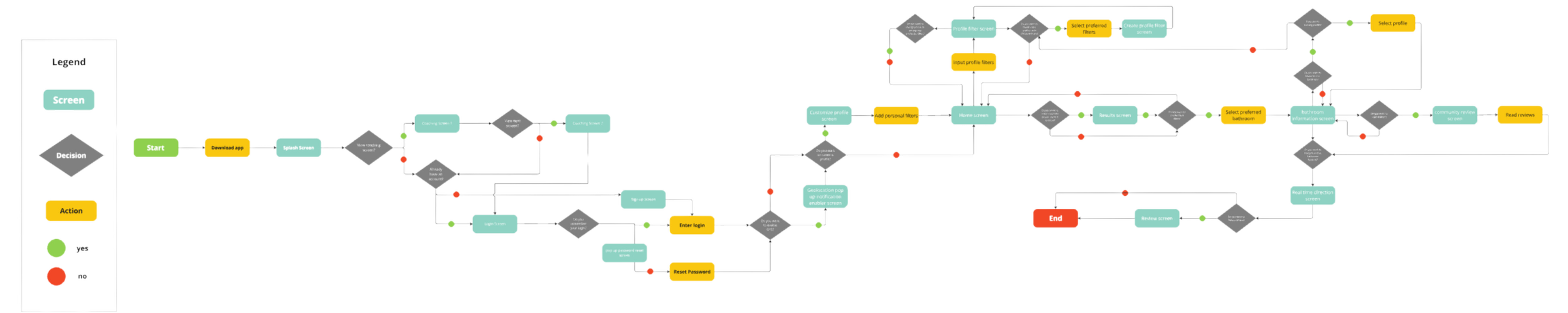
User Flow
The user flow of the app prioritizes three key features:
A mapping function with distance to the bathroom with a search that has a robust filtering function for first-time users
Adding profile settings that can be set up to include filters and favourite locations for regular users; additional profiles can be set up if travelling with a group or with children
Community reviews, photos, and sharing
Lo-Fi Wireframes
After finalizing our user flow, we created a basic lo-fidelity wireframe. I was responsible for the home & coaching screens, the review page, and the navigation map, although all three of us collaborated on screens as needed. See Figma prototype here
Home and Coaching Screens
Profile Screen
Results, Reviews, Real-Time Navigation, and Final Screen
User Testing and High-Fidelity Wireframe
Testing and Iterations
Before starting on our high-fidelity wireframe, we tested the effectiveness of the lo-fi wireframe we had created. See usability testing results here
It became clear to us that while the lo-fi iteration was a good start, there were some usability issues and the layout was cluttered and confusing. As we dove into the high-fidelity wireframe, we also decided that we should have an “Urgent” button, which overrides the profile settings to get the user to the closest bathroom available, for times when preferences and reviews don’t matter due to an emergency bathroom situation. This would be explained on the coaching screen.
High-Fidelity Wireframes
Home & Coaching Screens
Profile Screen
Results, Reviews, Real-Time Navigation, and Final Screen
Conclusion
This was the first group project I completed during the UX/UI Bootcamp, and I think it reflects the learning curve we were all navigating. While I’m quite pleased with the concept we developed and feel we incorporated some unique ideas that helped differentiate the app from others in the market, the final execution didn’t quite meet the design standards I aim for. Elements like the mascots, certain layout choices, and even the name leans toward a more juvenile aesthetic, which may not appeal to every user.
Our team collaboration was smooth for the most part, but as we transitioned into the high-fidelity prototype, there were some challenges in maintaining a cohesive design vision. One team member became particularly invested in her interpretation of the project and made several changes to my work without prior discussion, which was a bit frustrating given the tight three-week deadline. Despite this, I recognize that these experiences are part of working in a collaborative environment.
On a positive note, I thoroughly enjoyed brainstorming the app’s logic and appreciated how much I learned from this project. As someone new to UX/UI and Figma at the time, it was a valuable opportunity to explore design thinking in an app-based environment. The project highlighted the importance of clear communication and reinforced my confidence in expressing my design ideas in future collaborations.